You open your start page more than almost any screen you own. Dozens of times a day, every new tab, every browser launch. Most people leave that real estate as a default new-tab page stuffed with promoted articles and a search box they could have gotten from the address bar anyway. A dashboard of small widgets does better, but only if each widget actually does a job. A clock that looks nice but tells you nothing you didn't already know is clutter with a font.
So here are twelve widgets that earn their spot, grouped by the moment they're useful. The trick isn't adding all twelve. It's knowing why each one is there before you place it.
Time, weather, and what's coming
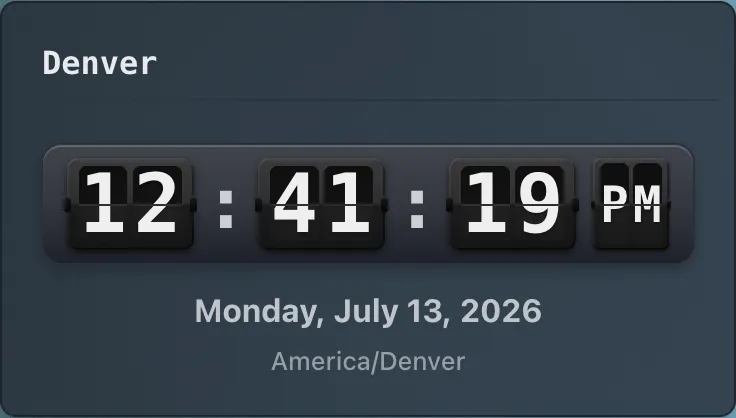
A clock seems too obvious to mention until you give it more than one time zone. One clock widget can show three or four, and that's the difference between glancing and doing arithmetic when your colleague in Berlin, your client in Sydney, or a market that opens in Tokyo is nine hours off. Most lists call this a "world clock" and stop there. The real use is a specific person or market you keep needing to reach without getting the hour wrong. Set the zones to people you actually talk to, not capital cities for decoration.
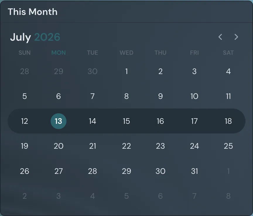
A month calendar earns its place by answering "what's this week look like" without a tab switch. You don't need a full scheduling app embedded in your home page. You need the shape of the next ten days at a glance so you stop being surprised by Thursday.
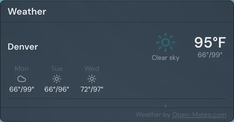
Weather is the cheapest win here. It replaces a habit you already have: open a tab, type your city, read one number, close the tab. A live weather widget does that for free, permanently, in the corner of your eye. Keep it small. It's a glance, not a feature.
Momentum widgets
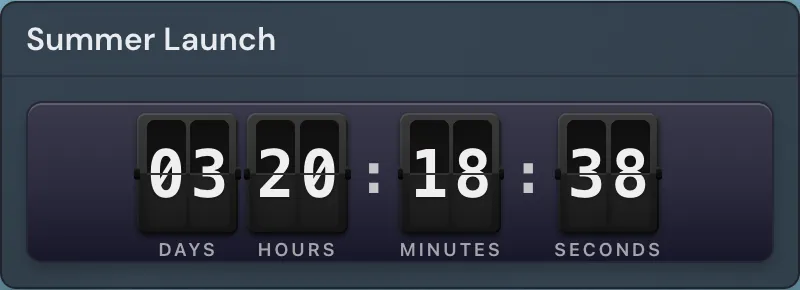
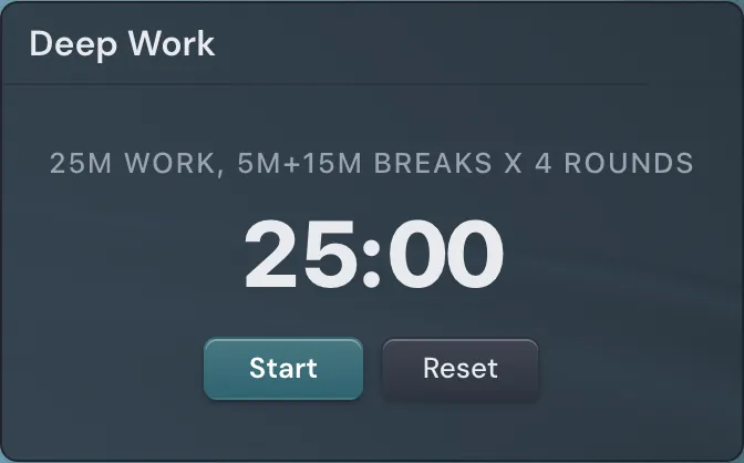
Countdowns and focus timers get lumped together in most write-ups, and they shouldn't be, because they do opposite jobs. A countdown points at a fixed date and ticks down to it: the product launch on the 14th, a conference, a contract deadline, a kid's birthday. You put it where you'll see it precisely because you want that date to stay slightly uncomfortable. A focus timer points at the next 25 minutes. It has nothing to do with a calendar. It boxes in the block in front of you so the 9am deep-work hour doesn't quietly become an email hour.
A countdown keeps a date uncomfortable. A focus timer keeps the next 25 minutes honest. Different jobs, different widgets.
Run both if your day has both shapes, which most days do. The countdown is the thing in the distance. The timer is the thing right now.
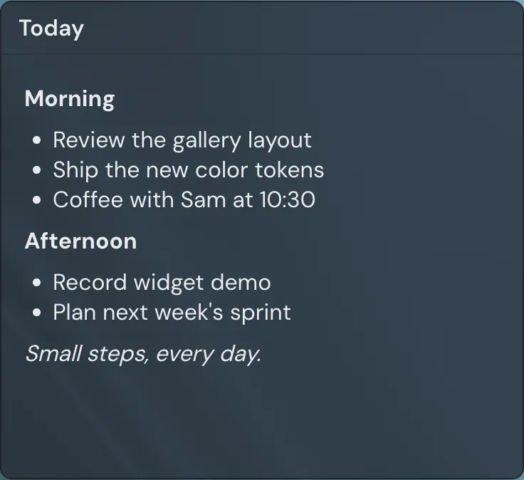
The third momentum widget is a notepad, ideally one that takes Markdown so a quick list stays a list and a heading stays a heading. Its single best use is your top three for the day. Write them at the start, look at them when you drift, clear them at the end. Not a second brain, not a project tracker. Three lines you'll actually reread because they're sitting on the page you open all day.
Signal without the doomscroll
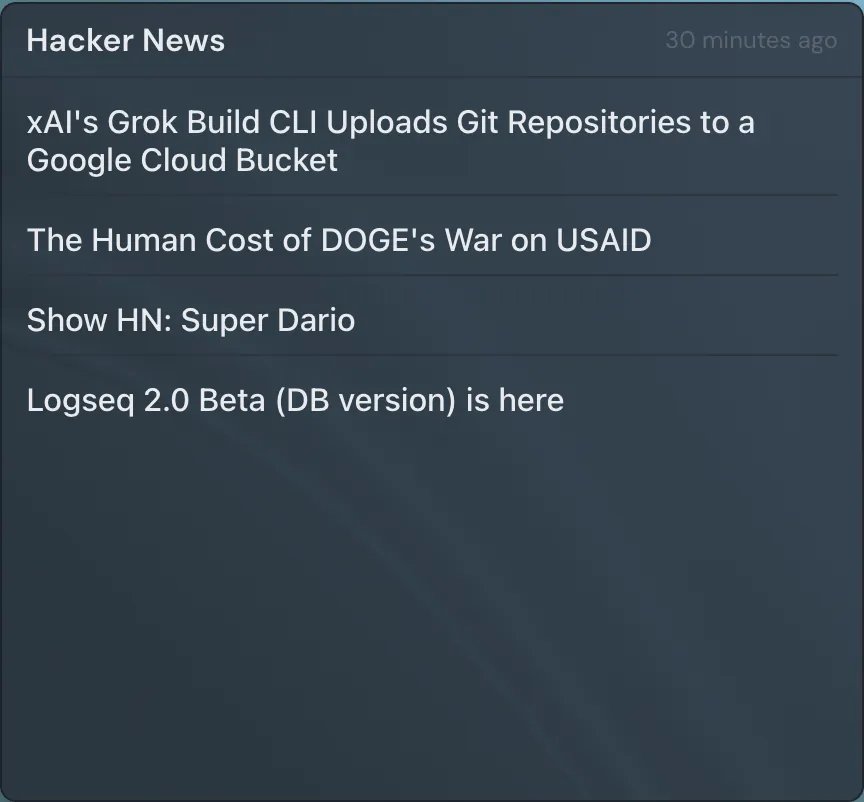
An RSS reader pays for itself by preventing other behavior. The reason you "just check" a news site or a subreddit at 10am is that you have no other way to find out whether anything happened in your field. An RSS feed pulls headlines from sources you chose into a box on your home page, so you get the scan without the visit and without the algorithmic detour that turns five minutes into forty. Point it at three or four feeds you trust, not twenty.
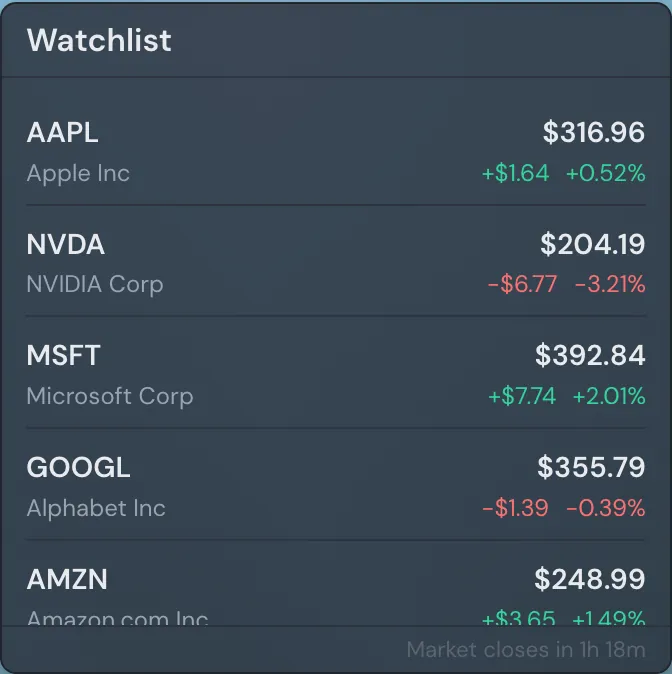
A stock or crypto watchlist belongs here for the same reason: it answers a question you'll otherwise go looking for. List the few tickers you genuinely track, not a wall of them. If you want to study a chart rather than glance at a number, a TradingView chart widget gives you the deeper view, but that's a second tool for when you're investing attention, not the everyday glance.
The case for a little play
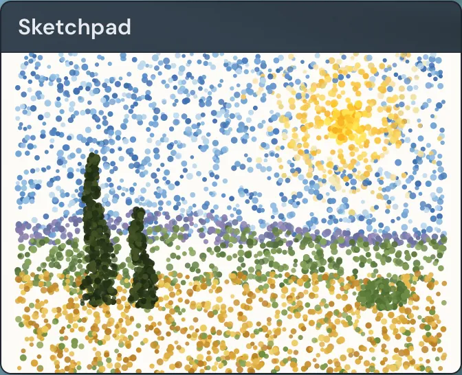
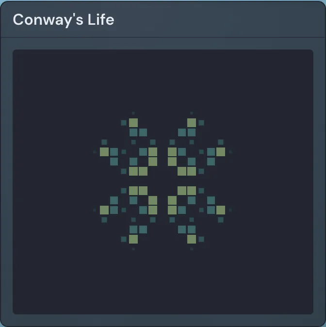
Most productivity advice treats anything fun as a distraction to be eliminated. That's wrong, and it makes for pages people quietly abandon. A sketchpad or doodle widget is a 30-second mental reset that doesn't involve leaving the page or opening anything that scrolls. So is a small game, the kind you finish in under a minute. The danger of a break isn't the break. It's the break that opens a feed and eats twenty minutes. A widget that keeps the reset on the page you'd return to anyway is the safer version, not the indulgent one.
Round it out with two cheap utilities: a daily quote if you like a small nudge, and a calculator and search box for the things you'd otherwise open a tab to do. None of these is essential. Pick the ones that match how you actually take a breather.
Arranging it so it stays calm
Every source on this repeats the same rule and almost none of them say how to follow it: start with three to five widgets, add more only when you feel an actual gap. That advice works because an overloaded start page stops reducing friction and starts adding it. You came to glance, and now you're parsing a dashboard. Here's the operational version of "keep it clean," which is more than "don't overcrowd":
- Give one widget the most space. A calendar or a timer is usually the hero; the rest stay small and glanceable around it.
- Group related things together. Time widgets in one cluster, signal widgets in another, so your eye learns where to look.
- Align everything to the grid and leave breathing room. White space reads as calm; cramming reads as noise.
- Pick one accent color and a quiet background. An animated shader looks great in screenshots and gets tiring at tab number forty.
- Keep separate pages for separate modes: a Work page, a Focus page with almost nothing on it, a Personal page. Don't make one page serve three lives.
- Prune monthly. Any widget you stopped looking at is taking up attention it no longer earns.
Most tools that build these pages give you a drag-resize-snap grid and the widgets above. Linkamatic is the one I build mine on. It ships all of these widgets natively, it's free with no account barrier (email or Google sign-in), and you can set a page as your browser's home or new-tab page so it opens on every launch. The part nobody else does: each page has its own public URL, a collaborator can be invited with edit access, and anyone can remix a public page into their own account in one click. So when you finish a layout that works, you can hand someone the exact page instead of describing it.
Whatever you build it in, the test is the same after a week of use. Open the page and notice what your eyes go to and what they skip. The things you skip aren't widgets. They're decoration, and they should come off the page before they teach you to ignore the rest of it.