
You open a new browser tab maybe forty times a day. Most of the time that screen shows a search box, a row of frequently-visited sites you don't actually want to visit, and a wallpaper. It's a coin flip whether the next thing you do is the work you meant to do or twenty minutes on a news site you didn't decide to read. Shift's productivity guide cites the grim numbers: an interruption roughly every eight minutes, and about fifteen minutes to get your head back where it was afterward. The new-tab page is the one screen in that loop you fully control. Redesign it and you change the default the rest of the day is fighting against.
The usual advice for fixing it is to bolt together a handful of browser extensions. The popular dopamine-free-browser writeup wires up three: Redirector to bounce distracting sites to a reminder page, Bonjourr for a minimal start page, Forest for blocking. Another widely-shared guide stacks five Chrome extensions to do roughly the same job. Each piece works, but you end up maintaining a small Rube Goldberg machine across three tools that don't know about each other. The deep-work writing warns against exactly this kind of tool sprawl, and then the focus-setup guides recreate it.
Subtract before you add
Start from an empty page. Add one element only when you can say out loud what job it does. That's the whole method, and almost nobody states it plainly even though every guide circles it. Todoist's deep-work guide gives the research version: list your goals, pick the two or three activities that actually move them, keep only the tools with a real positive effect, drop the rest. Most distraction advice is subtractive anyway. Declutter your bookmarks. Close the tabs. Disable autoplay. Turn off notifications. The winning move is removing things, not collecting more of them.
This is also why pretty dashboards quietly work against you. Flocus is gorgeous and bundles ambient soundscapes, streaks, and stats on top of its timer and clock. Streaks and background audio feel productive. They're also a second thing competing for your attention on the one surface that was supposed to have none. If you can't name the job a feature does for the task in front of you, it's noise wearing a focus costume.
The core trio
Strip a focus page down and the same three things survive across every credible source: a timer, somewhere to capture a thought, and a short list of links. Not a wall of bookmarks. Three to eight links, the ones you actually open to start working.
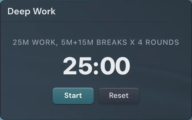
The timer is non-negotiable, and the kind matters. A work timer counts down a fixed block, 25 minutes in the classic Pomodoro shape. Todoist suggests starting sessions at fifteen minutes and stretching them as your focus muscle grows, and capping deep work around four hours a day because concentration falls off a cliff past that. The other half of the timer idea is time pressure: estimate how long a task will take, cut that in half, and race it. A shrinking number on screen makes a deadline feel real in a way a calendar entry never does.
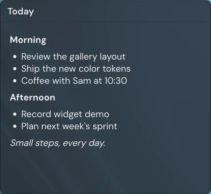
The capture element solves the problem every guide complains about and then fails to fix. You're mid-task, a stray thought lands (email the accountant, check the staging build), and the wrong move is opening a new tab to deal with it, because that tab is where focus goes to die. The usual fix is a separate capture tool like Save to Notion, which is still a context switch, just a tidier one. A notes widget living on the page closes the loop. You jot the thought without leaving the screen you're working from. It's the digital version of the sticky note on the monitor that Todoist recommends for your one wildly-important goal: keep it visible, keep it on the surface.
Show one thing at a time. Momentum displays a single daily goal. Flocus's to-do list surfaces one priority. A dense dashboard with twelve readouts is the opposite of focus, however good it looks in a screenshot.
If you can't name the job a widget does, it's distraction wearing a focus costume.
Countdowns versus work timers
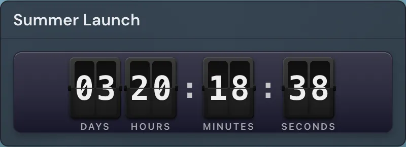
Two different tools get blurred together because both involve numbers going down. A work timer runs a session: twenty-five minutes, go. A countdown ticks toward a real date, the days and hours left until a launch, a deadline, a flight. Both create pressure, but for different time horizons. Put a 25-minute timer on the page for the next block of work, and a countdown to the date that actually matters this month so it's the first thing you see every time you open the browser. Watching the days drop from 14 to 9 to 4 does more to reorder your priorities than any to-do list.
A theme that gets out of the way
Calm visuals aren't decoration; they cut the pull to wander. But most advice stops at "pick a clean theme," which is useless. Here's a recipe you can actually follow. One muted base colour, a slate or a deep ocean tone rather than stark white. Exactly one accent colour, and spend it on the timer so your eye lands there first. Generous spacing between elements. No animated background; a drifting shader looks great for the first hour and then becomes motion you tune out, or worse, motion you don't. The single-accent rule is the load-bearing one. When only one thing on the page is coloured, that thing is where you look.
Linkamatic is built around this exact setup, which is why I'm mentioning it. It's a free drag-and-drop page where you place links and small widgets on a grid: a focus/Pomodoro timer, a Markdown notes pad, a countdown, plus the short link list. Enter edit mode to arrange everything, then exit and the editing chrome disappears, leaving the bare page. It ships six muted preset themes (Slate, Ocean, Forest among them) with a single accent colour and corner rounding, so the one-base-one-accent look is a few clicks rather than a CSS project. Set the finished page as your browser's home and new-tab, and deep work becomes the thing you see by default.
Keep this page separate from your everyday tabs. One private focus page, one normal page for everything else, so the calm surface doesn't slowly fill up with the links you open at 4pm on a Friday. Linkamatic lets you keep multiple pages and mark them private, which makes the split easy to hold.
One last thing the screenshot-judging crowd gets wrong: don't trust a setup from a picture. Build the page with your real links, set it as your home, and live with it for a full workweek. Then trim. The link you never clicked comes off. The widget you stopped looking at comes off. After two weeks of weekly trims you'll have a page that does three jobs and nothing else, which was the point.