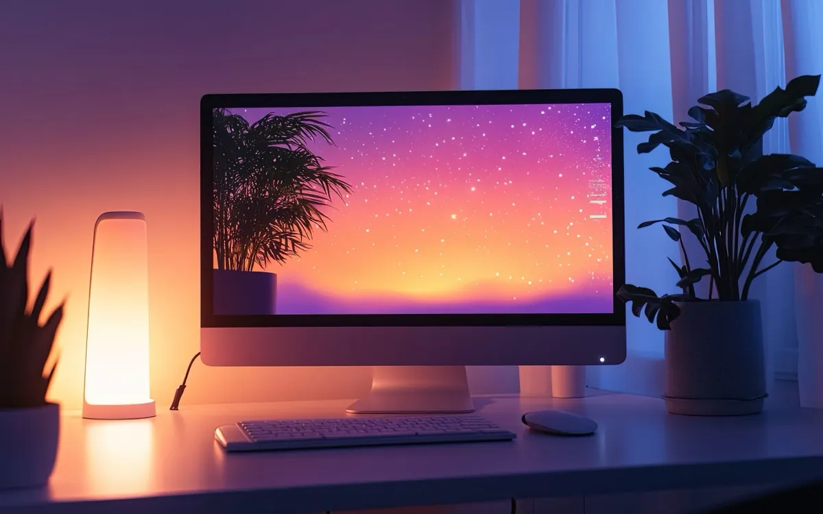
You open the same screen 30 or 40 times a day and have probably never decided what it should look like. Whatever your browser shipped with, a blank new tab or a grid of sites it guessed from your history, that's the surface you stare at more than almost any other. Because nobody chose it, it reads as nobody's. A page that looks like a default gets treated like one: glanced past, never lingered on, replaced by whatever you actually came to do.
That's the quiet cost of a generic start page. It works fine. You can still type a URL. But it asks nothing of you and gives nothing back, so it never becomes a place you go on purpose. Changing that takes less effort than people assume, and the reasons are better than the "dark mode saves your eyes" line every customization guide stops at.
Why a page you built is a page you'll open
There's research behind the feeling that a space you shaped is one you keep coming back to. A study of 87 office workers found that people stuck in generic, undecorated, low-privacy desks reported the highest emotional exhaustion, while those who personalized their space with photos, a mug, a poster, reported noticeably less. The mechanism is the interesting part. The benefit wasn't decoration for its own sake. It came from control and ownership, from making a place of your own inside a space you don't fully control. It's directional evidence (small sample, one site), but it points somewhere specific: claiming a space is what restores the energy, not the stuff you put in it.
The same thing shows up in what behavioral economists call the IKEA effect. People overvalue things they helped build, because the effort creates a bond. Labor leads to love, and it's separate from owning; the attachment comes from the work. There's a condition that matters here more than anywhere: the effect only appears when you finish. People who built something and then took it apart, or never completed it, got no boost at all. A half-arranged page does nothing for you. A finished one feels like yours.
Put those together and you get a useful rule. The payoff isn't picking a nice theme from a menu. It's doing the arranging yourself and getting it to a state you'd call done. That's what turns a screen into a place.
A half-arranged page does nothing for you. A finished one feels like yours.
Light, dark, and a background that sets a mood
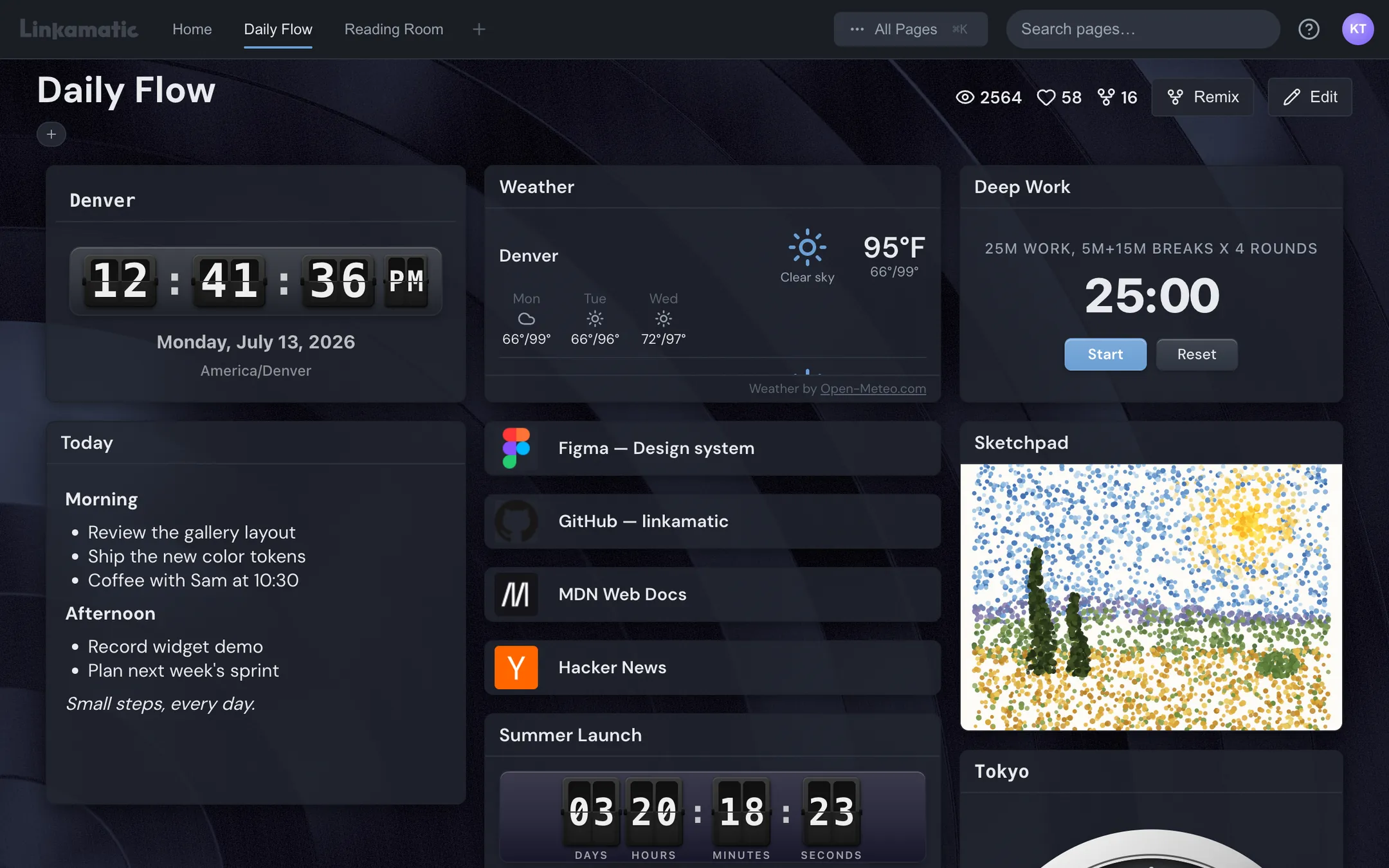
Dark mode is table stakes, and every guide frames it the same way: easier on the eyes in low light, kinder to OLED battery. True enough. If you're working late or your room is dim, dark wins, and a "follow the system schedule" setting that flips it automatically at sunset is the obvious default. But light mode still beats dark in a bright room or full daylight, where dark text on a pale background is simply easier to read. Pick by where you actually sit, not by which one looks cooler in a screenshot.
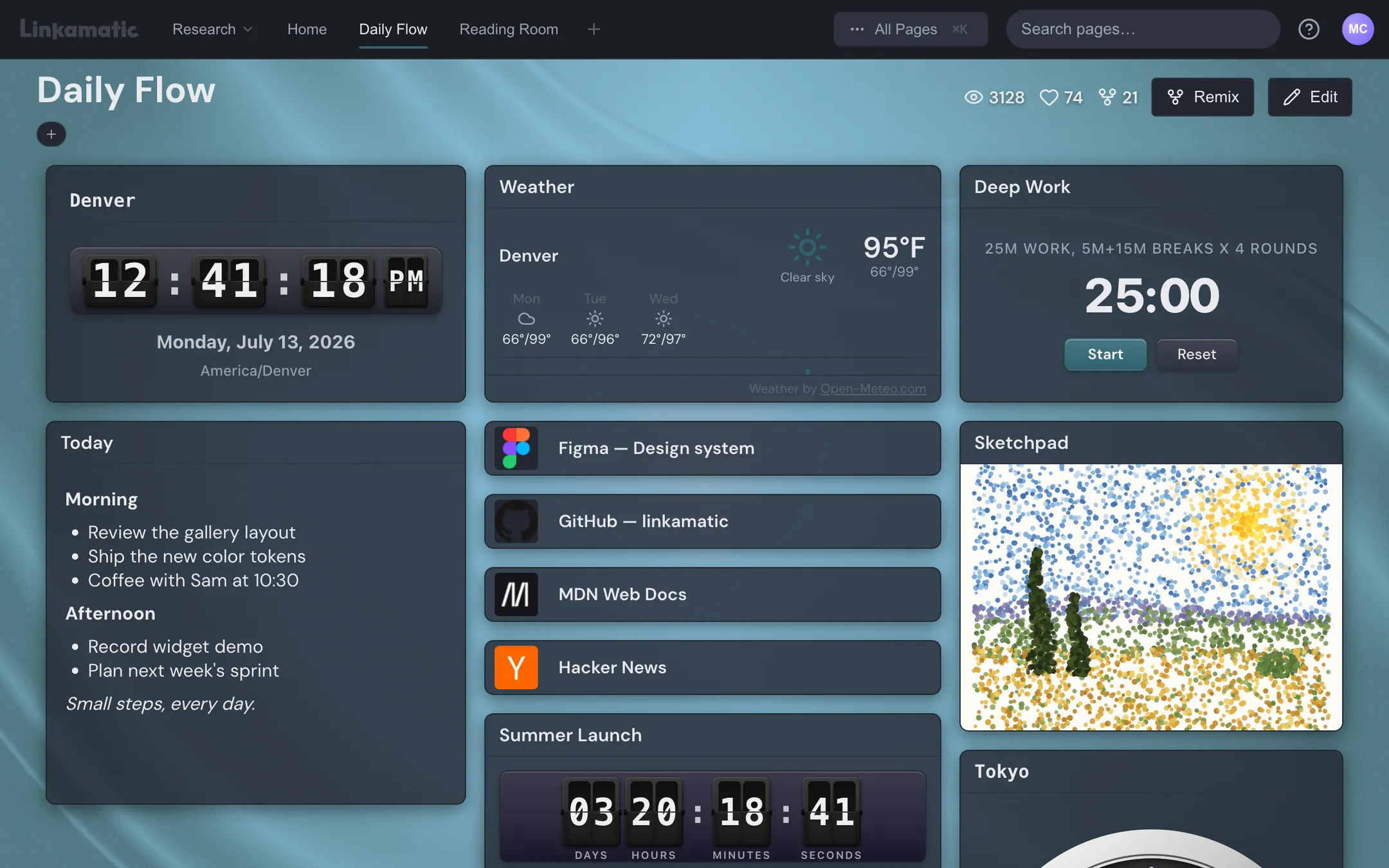
The background is where you set a mood, and where restraint earns its keep. A still image, your own photo, a preset, a flat color, is the safe choice. Some tools go further with a living background, a slow shader that drifts behind your widgets. Used well, that's atmosphere: a calm tide, a soft gradient breathing. Used badly, it's a screensaver fighting your attention every time you try to read the weather. If you reach for motion, keep it slow and low-contrast. The background's job is to make the page feel like somewhere, not to perform.
One font, one accent, and the discipline to stop there
Fonts get treated as a readability setting and nothing more: bump the size up if your eyes are tired. Fine advice, and it misses the point. A typeface carries personality. A geometric sans reads clean and modern, a warmer humanist face feels softer, a mono font reads like a terminal and signals you work here. You don't need five of them. Pick one that reads as you and let it carry the whole page.
Same with accent color. One strong choice beats a rainbow. A single accent on your links, your active states, your timer ties everything together and tells you at a glance what's interactive. Add corner rounding to taste (sharp corners feel technical, rounded ones feel friendly) and check your contrast so nothing strains to be read. That's the whole palette. The temptation is always to keep adding, a different color per widget, a second font for variety, and every addition makes the page louder and less yours. The workspace research is blunt: the benefit is ownership, not volume. Restraint is personalization too.
- One font that matches the mood you want, not three for variety
- One accent color doing all the interactive-state work
- Rounding and contrast set for comfort, then left alone
- A background that sits behind the content instead of competing with it
Arrange it so it fits how you think
Here's where browser-native customization runs out of road, fast. The practical guides for Chrome and the rest cover themes, one background, a handful of shortcuts, and then they all quietly tell you to install an extension. A new-tab page is a flat list. You can curate which links show, which beats letting it auto-fill from your history, but you can't arrange them in space. You can't put the clock top-left because that's where your eye lands first, the things you act on down the middle, the things you only glance at off to the side.
Spatial layout is a mental model. What you check (weather, calendar, a feed) and what you do (search, notes, a timer) want to live in different regions, sized to match how often you touch them. That arranging is also the effort the IKEA effect runs on. Dragging a widget, resizing it, snapping it where it belongs, then standing back and deciding the page is done, that's the work that makes you come back to it. A flat shortcut grid can't give you that, because there's nothing to arrange.
A drag-and-drop grid is the tool that fits the principle. Linkamatic is built around this: you drop in links and small widgets, a flip or analog clock with multiple time zones, live weather, a month calendar, a Pomodoro timer, Markdown notes, an RSS reader, a stock or crypto watchlist, a search box, even a sketchpad or a calculator, then drag and resize them on a grid until the layout matches how you actually use the page. You're the one arranging it, which is the whole point. Sitting under that are six themes (Breeze, Slate, Ocean, Ember, Forest, Midnight), your own font, accent, rounding, and the animated backgrounds, so the look and the layout are both yours rather than a skin over a fixed template.
Make it the thing you open
None of this matters if the page sits in a bookmark you forget. Set your page as the browser's home and new-tab page, so it loads every time you open a window or hit the plus button. That's when the payoff lands, at the daily launch, the moment you're already there. A start page you have to navigate to is a project. A start page that just appears is a habit.
You can wire any URL into your browser's startup and new-tab settings, and a Linkamatic page is built to be that URL; every page gets its own address and can be set as your home or new-tab page. If you want to build the thing this article describes, themes, your font, the animated background, a grid you arrange yourself and set as your home page, it's free to do.
The difference between a screen you tolerate and one you're glad to see isn't taste or budget. It's whether you spent ten minutes claiming it. Pick the mood, pick one font and one color, arrange the page until it's done, and point your browser at it. After that it stops being something the browser handed you and starts being where you open the day.