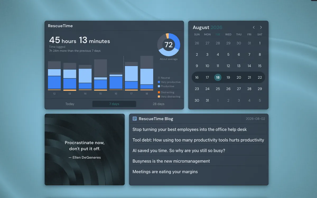
RescueTime has been running on my machine for years. It knows how long I spent in a terminal yesterday, how much of Tuesday afternoon disappeared into Slack, and exactly which twenty minutes went to a video about lathe tooling. I open its dashboard about twice a month, usually because something has already gone wrong with my week.
That gap is the recurring failure of passive time tracking. Collection is automatic, and reading is not. The tracker does its half perfectly and then waits for you to remember it exists, which is the same ask that killed the spreadsheet you were going to keep. Reviews of RescueTime say the same thing in politer language: great data, real learning curve, reports that take effort to sit down with.
What the pulse number actually means
RescueTime sorts everything you touch into five productivity levels and scores the result from 0 to 100. The arithmetic is public: distracting time counts 0, personal 1, neutral 2, other work 3, and focus work 4, then the total is divided by what a perfect day would have scored. RescueTime documents the formula if you want the exact equation. All day in focus work is 100. Half focus, half distraction is 50.
One number carrying all of that has an obvious weakness. A 66 built from a wall of neutral time and a 66 built from four hours of deep work and two hours of YouTube are the same score describing completely different days. The first one is a slow day. The second is a day with a hole in it, and the hole is the thing you would want to know about.
A score tells you the day happened. The shape tells you when it went wrong.
Data you have to go and fetch is data you skip
Every tool in this category is really an awareness tool. It works by putting a fact in front of you often enough that you start making different choices before the fact turns bad. That mechanism needs the fact to be visible without effort. A dashboard on another site, behind a login, is a destination, and destinations get visited on purpose, which is to say rarely.
The page my browser opens is different. I see it dozens of times a day without deciding to. Anything on it gets read whether or not I meant to read it, which is why the weather widget has changed how I dress and the RescueTime dashboard has never changed anything.
Putting the numbers where I already look
So they moved. Linkamatic now has a RescueTime widget: connect your account once, and your own statistics render on your own page, next to whatever else you keep there.
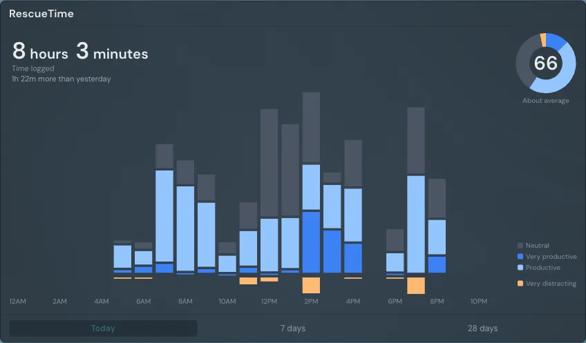
The headline is time logged for the period, with the comparison against the period before it underneath. The ring on the right is the pulse, divided into the five levels that produced it, so the mix is right there next to the score. The chart is the day in one-hour bars, using RescueTime’s own convention of hanging distracting time below the axis. Two seconds of looking answers a question the number alone cannot: was that a flat day, or a good morning followed by a collapse.
Mine collapses at about three in the afternoon with impressive consistency, which I did not know until the chart was somewhere I could not avoid it.
Rolling windows, not calendar weeks
The first version showed the current calendar week and month, and it was useless on Mondays. One day of logged time compared against a full seven-day week reads as a catastrophic drop every time, and the comparison is arithmetic nonsense: 5h 55m against 44h 51m says nothing except that the week is young.
So the two longer views became rolling windows ending today. The last 7 days against the 7 days before that, the last 28 days against the 28 before those. Both halves are always the same length, so the difference reflects your time rather than the position of the calendar.
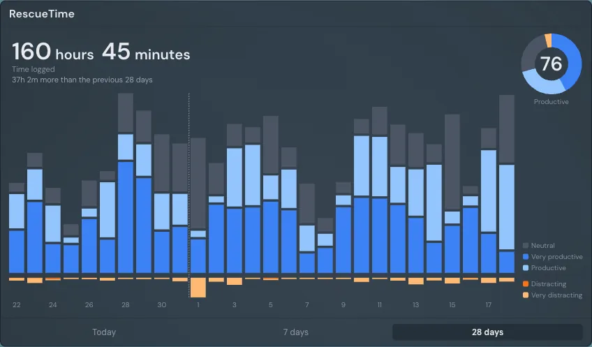
Twenty-eight rather than thirty is the same argument one level down. A 30-day window can hold five Saturdays in one half and four in the other, and weekend composition moves a productivity score more than anything you did on purpose. Four weeks against four weeks is the only comparison where the weekdays cancel out. The dotted divider is there because a rolling window loses the calendar otherwise, and people still want to know where the month ended.
One bar at a time
Rest the pointer on any bar and the breakdown for that bucket opens: every level with its time, and the total under them. It waits until you have actually stopped on a bar, so dragging across the chart does not fire a panel at every step.
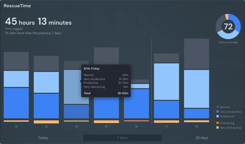
Clicking the totals opens your RescueTime dashboard in a new tab, on the same day you were looking at. The widget is a glance, not a replacement for the reports. When a number surprises you, the real thing is one click away.
Your numbers, and nobody else’s
The widget always shows the statistics of whoever is reading the page. Put one on a page you share with your team and your collaborators do not see your hours; they see a prompt to connect their own account, and their own numbers if they take it. Share the page publicly and a stranger sees the same prompt. There is no configuration for this and no way to switch it off, which is the correct number of ways to leak a colleague’s afternoon.
Linkamatic asks RescueTime for two things: your time data and your productivity levels. It cannot change anything in your account, and disconnecting takes one click in the widget settings. Delete your last RescueTime widget and the stored access is discarded on its own, because there is nothing left to show it in.
Setting it up
All of this assumes RescueTime is already running on your machines. If it is not, that is the part worth doing first, and I recommend it without reservation: RescueTime installs once, categorizes everything you touch without asking you to start or stop anything, and the free tier covers every number this widget reads. Years of mine are the only honest record I have of where my working days actually went. Sign up, let it watch for a week, and the widget will have something to say by the time you come back to it.
- Open the page you want it on and click Edit, then Add Widget.
- Choose RescueTime, under Data.
- Click Connect RescueTime and approve access on rescuetime.com.
- You land back on your page with the numbers already loaded.
After that it looks after itself. It refreshes while the page is in front of you, every 15 minutes or every 5 if your RescueTime plan syncs at the faster rate, and stops when you switch tabs so a page left open all night is not quietly polling until morning. It picks back up when you return.
None of this makes you spend the afternoon better. It just removes the excuse that you did not know how you spent it. Mine is on the page beside a calendar and a feed of the things I would rather be reading, and the three of them together have made my three o’clock habit considerably harder to ignore.