The Container widget holds its own grid of other widgets. Instead of scattering related tiles across a page, you gather them inside one container and move, resize, or rename the whole group as a unit — everything inside comes along. Containers are a tidy way to build sections on a page: a Work container for your job links, a Reading container for feeds and notes, or a Tools container for a calculator and a timer.
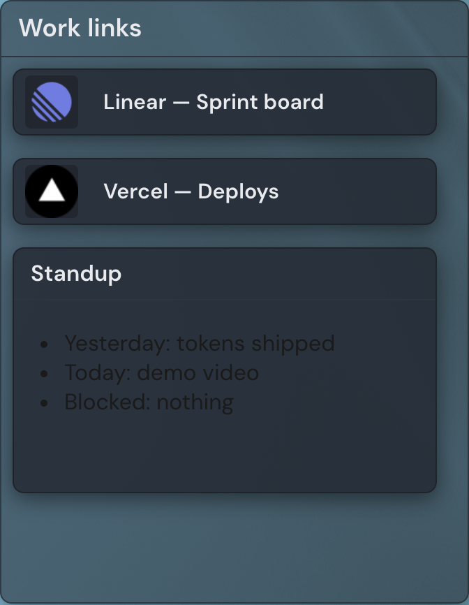
Adding the Container widget
- Open the page you want to add it to and click Edit in the page header.
- Click Add Widget.
- Choose Container from the picker (it is in the General category).
- Fill in the options you want (you can change them anytime) and save.
A new container arrives with the title "Group" and a size of 14 by 14 cells — large enough to hold a widget or two with room to drag more in. You can rename and resize it at any time.
Settings
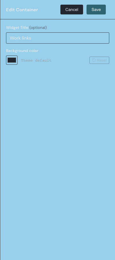
Open a container's settings from the gear on its toolbar in edit mode. A container has two options.
| Setting | What it does |
|---|---|
| Widget Title | The name shown in the header at the top of the container. It starts as "Group"; rename it to label the section — Work, Reading, Tools — or clear it. Up to 80 characters. |
| Background color | The container's background color. Leave it on the theme default, or pick a color and use Reset to return to the default. A container is drawn a little more see-through than a normal widget, so the tiles inside stand out against it. |
Adding widgets to a container
In edit mode, a container shows a small + button in its header. Click it to open the widget picker, and whatever you choose lands inside the container's own sub-grid instead of on the main page. The Container type is not offered in this picker — a container can hold any widget except another container, so grouping stays one level deep.
While a container is empty and the page is in edit mode, it shows a "Drop widgets here or click + to add" prompt. The header stays visible in edit mode even when the title is blank, so the + button is always within reach.
Dragging widgets in and out
You can also fill a container from widgets already on the page. In edit mode, drag a top-level widget off the page and drop it into a container to make it a child; drag a child back out onto the page to turn it into a regular page widget again. Each move takes a single drag with no extra confirmation, and the widget keeps all of its settings — a link's address and label, for example, are unchanged by the move. Inside a container, drag children around to rearrange them the same way you would on the page.
Moving and resizing
Move a container by its drag handle and every widget inside travels with it — that is the whole point of grouping a section together. To resize, drag an edge or corner. A container will not shrink smaller than the widgets it currently holds, so nothing inside gets clipped.
Containers pair naturally with Link tiles for topic-specific link clusters. For a refresher on adding, moving, and resizing any widget, see widget basics.